Today on Mean, Median, and Moose, we look at eight legged blood suckers, phone company cell coverage, self reported bike accidents, and community edited maps! What do these data sets have in common? They’re all involving data collected by volunteers in the general public.
eTick
eTick is a collaboration of a variety of universities, public health organizations and government departments to identify and track ticks and tick bites in Canada. Public health is interested in tick bites because ticks are a vector for diseases such as Lyme disease and Rocky Mountain Spotted Fever. People submit pictures of ticks to the website in order to have them quickly identified by experts. Identification is helpful for the public because not all diseases are equal (for example, Lyme disease can be quite serious) and not all ticks carry the same diseases. Researchers benefit by having the public at large send in information such as where a tick was found, whether it was on a human host, a pet, or on the ground, and pictures of the specimen. As you can imagine, having that kind of Canada-wide survey of tick species and behaviour can be very helpful for research.
So, the public benefits through identification and open data. The researchers benefit by having a much larger number of people providing information about ticks. It’s a great example of both parties benefiting from crowdsourcing. The website is also extremely popular with 784 specimens being submitted in the week prior to this article being written – that’s an average of 112 ticks a day.
eTick provides all of the data submitted to the website to the public here:
https://www.etick.ca/etickapp/en/ticks/public/list
They even provide a great map of where ticks were found here:
https://www.etick.ca/etickapp/en/ticks/public/map
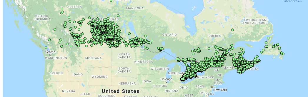
That’s a great map if you are interested in zooming into your neighborhood and seeing which ticks were found near you, but it’s not such a great map if you’re curious about where the largest number of ticks were found. Never fear, Mean, Median and Moose are here to satisfy your curiosity. Here’s a heat map built in DeckGL showing tick reporting density:
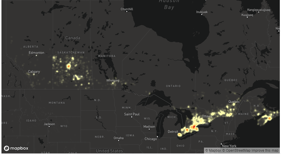
If you take population into account, Central Saskatchewan has to be the tick capital of Canada. Here’s another view of the data if hex binned maps are more your thing:
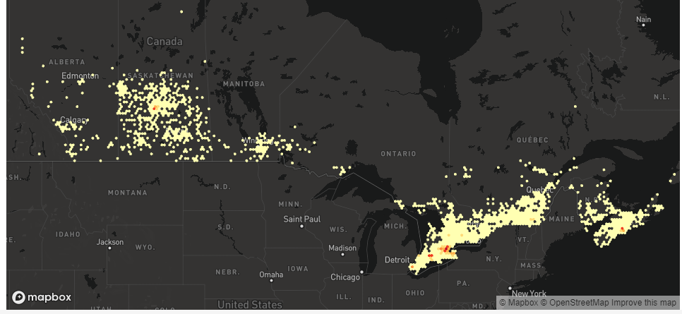
Windsor, London, Niagra, Saskatoon and Halifax – Tickiest places in Canada. Want to zoom in on the density maps or play around with the code? You can find that here:
https://observablehq.com/@johnhaldeman/etick-maps
BikeMaps
Ever wonder how safe cycling is in your city? BikeMaps.org is a crowdsource tool for global mapping of cycling safety that can help you figure that out. Users can report a variety of incidents, including collisions, near-misses, hazards, bike thefts, and new infrastructure. They can also download the Strava cycling app that uploads rider density data directly to the site. Even better, if you’re only interested in particular areas that you cycle through often, you can set up an alert area to update you on changes in that area.

There’s a map view where you can see individual incident points, but you can also use their visualization tool to target one area and see data grouped as a heat map and in charts. This is perhaps most useful in a bigger city like Toronto where there are bound to be more incidents. Looking at Toronto’s, for example, you can see incidents are more prevalent on weekdays, so it’s actually safer to ride on weekends (if you trust this user-reported data of course)!
On that note, it seems incidents are under-reported in most areas. Since January 2020, only 756 incidents were reported in all of Canada and the U.S., which seems quite low. However, this data is still useful to fill in data gaps, as authors of the paper “What does crowdsourced data tell us about bicycling injury? A case study in a mid-sized Canadian city” write. Using this data in combination with other cycling data can help solve safety problems, such as where safety infrastructure is lacking to support safe left turns. It demonstrates the potential crowd sourced data can hold for problem solving, especially when combined with other data sources.
Telecom Reliability Data – Tutela
Each year Tutela put out a State of Mobile Experience report for Canada and numerous other countries around the world. In the report they benchmark major tele-com carriers against each other by testing network connections and quality across the country through 900,000 speed and latency tests during a over a several month period. They collect data on the wireless user device, network connection and quality for a total of 12 KPI that go beyond “number of bars”.
They stress that they don’t collect any personal data supported through a Privacy Charter assessed by PWC.
They predominantly sell this data to other companies – cell phone companies, wireless service provider and app developers to help them determine performance of their services on various networks and phones.

Local Crowdsourcing and Awareness
Our local town has had quite a bit of controversy about the proposed location for a new hospital, and in 2019 I worked with a small team of people to build a website that used a crowdsourcing technique to tackle one aspect of the controversy: drive times to the current and proposed hospital locations. We launched a website that let users enter a location or use their current location to compare their drive times for the different locations. We had a decent press response and got more than 2500 requests in about 10 days. I analyzed the data and wrote it up on my sadly neglected medium page, which you can find if you search my name on medium.com https://medium.com/@doug.sartori/megahospital-challenge-findings-e1d05c3e48e1
It was an interesting way to generate data and although being part of a raging controversy for a few days wasn’t the most fun I’ve ever had, using user-provided data was a powerful tool that had an impact on the debate.
Open Street Map
OpenStreetMap (OSM) is a collaborative mapping project. It is free and editable by anyone. The project started in 2004 and since then it has become an impressive source of geospatial data. The scope of the project is so large that it’s hard to summarize it in a few sentences: there are dozens of tools and visualizations available for OSM. Map data has mainly been produced by volunteers, often by ground survey with data recorded on GPS. In recent years, satellite imagery has been incorporated into the OSM application to make it easier for users to make modifications.
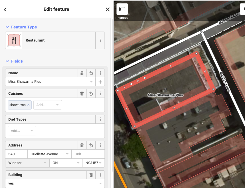
For the podcast, I decided to try my hand at editing OpenStreetMap so I created an account, navigated to my home and work neighbourhoods, and made a few useful edits. It’s quite easy to make changes and updates are integrated into the map almost immediately. For example, here is the interface view as I added the shawarma restaurant next to my office building. The satellite imagery and building outlines make accurate edits a breeze.
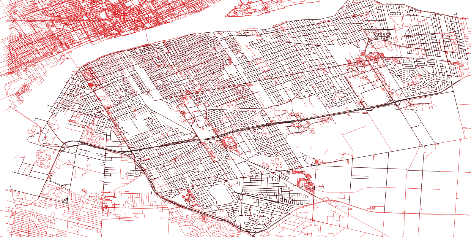
Besides the web interface, there are dedicated tools for making changes to OpenStreetMap. Potlatch, now in Version 3, is the primary desktop application for editing OSM. There are web and mobile apps like Pushpin OSM for iOS, and a gamified Android app called StreetComplete, which sends users on “quests” to contribute data to the map. Of interest to our listeners – QGIS has OSM support through a plugin. In QGIS 3, adding the QuickOSM plugin gives you instant access to QGIS data for roads, trails, buildings and points of interest. For comparison I did a simple QuickOSM query for “highway” data in Windsor, Ontario and overlaid the official City-provided street centerlines shapefile. The mass of red to the north and south are neighbouring municipalities, but even within the city limits there is a ton of new information here! Some of those red lines represent trails, private roads, and parking lots (you can make out the local mall’s parking lot just south of the thick east-west expressway) as well as alleys which are not provided in the City dataset.
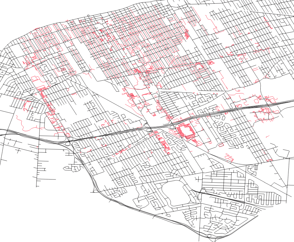
You can be more fine-grained in your QuickOSM queries. Instead of getting all street data (key=”highway”) I repeated the query asking only for data where the value of the highway key was “service” – alleys, parking lots and private roads. This allowed me to supplement the official street map more cleanly:
As I noted earlier, you can also query points of interest. I queried for “cafes” with QuickOSM and generated a map of the coffee shops within walking distance of my office.
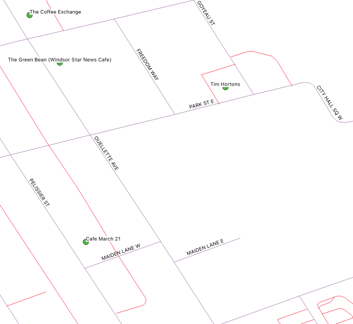
Not bad, but there’s a now-closed cafe on that map and a newer option missing. The good news is that I can easily fix it! OpenStreetMap is a fantastic resource for mapping applications, but more than that it’s an open community effort that has an incredibly low barrier to entry for contributions.
